Create Powerful CTA's In Seconds
Your CTA should be like a diamond for your readers—precious, clear, and valuable.
It should reflect the promise of what you’re offering, standing out with the clarity of its purpose and the benefit it provides.
Just as a diamond draws attention and carries value, a strong CTA captures interest and gives readers a clear reason to act, aligned with the benefits you’ve promised.
If a diamond digger misses the clues to where the diamond is hidden, he’ll keep digging aimlessly, and might never find it.
Your text works the same way: if it isn’t persuasive and clear enough, no one will be drawn to click your CTA.
Every word leading up to your CTA should act like a trail of clues, building desire and guiding readers right to that valuable action.
A CTA might seem simple, but it’s often misunderstood. It’s not just about making one or getting creative with it—it’s about truly understanding your reader: their patience, their needs, and their pain points.
A CTA isn’t just a button; it’s the harmony and balance of everything around it, working together to guide action.
If the text isn't convincing enough no one will click your CTA.
If the content isn't engaging enough no one will scroll to the CTA.
Does the CTA truly Pop and stand out?
If your CTA doesn’t align with the content, it won’t stand out—so make this your first priority.
In this guide, you’ll learn to master the art of creating a CTA—from finding harmony within your content to uncovering the unwritten rules that make CTAs truly persuasive.
Don't overcomplicate
The key to an attractive CTA is, surprisingly, to “become dumber”—by simplifying and stripping away complex language. Here’s why that works:
A common mistake is overthinking CTAs, making them overly clever or complicated, which can dilute the message. But by “becoming dumber,” or rather, speaking simply and directly, you help the CTA immediately resonate with your audience. A straightforward CTA should feel like a no-brainer for the reader, requiring zero extra thought or effort to understand.
A CTA should only be 2-5 words long, as it has to have time to be direct but also not too long.
Using first-person language in CTAs (calls to action) creates a stronger personal connection by making the user feel that the action is uniquely theirs, which increases engagement and motivation.
Studies in neuro-linguistic programming (NLP) and cognitive psychology show that first-person language triggers emotional resonance and a sense of ownership, leading to higher conversion rates.
This is because the brain processes self-referencing language more easily and finds it more persuasive. (Liu & Ma, (2015; Cialdini, 2009)
Create Intense Urgency
Creating a sense of urgency in your CTA can significantly increase the likelihood of a reader taking action.
FOMO (Fear of Missing Out) is a simple yet powerful psychological trigger that taps into our natural desire to avoid loss.
By highlighting the risk of missing an opportunity, these phrases compel readers to act quickly, leveraging the instinctive fear of being left behind.
Mini Tip!
Personalized CTA text significantly enhances engagement and conversions. By speaking directly to the user with language tailored to their needs or interests, you create a sense of relevance and connection. Studies show that personalized CTAs (e.g., "Get My Discount" instead of "Get Your Discount") can increase conversion rates by over 40%. (HubSpot)
Know that "Color Matter"
Choosing the right color is crucial, as some hues can fade into the background, while others stand out as vibrant stars in an otherwise empty space.
The psychology of color can greatly influence the effectiveness of your design—certain colors can evoke strong emotional responses or draw attention in ways that others cannot.
For instance, red and orange are often associated with urgency and excitement, making them ideal for CTAs, while softer tones like blue and green convey trust and calmness.
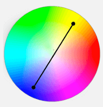
The easiest way to find the perfect color for your design is by using the color wheel. Identify the dominant color of your project and select the one directly opposite it.
This complementary color tends to create the strongest contrast and draws the most attention.
To craft the ultimate CTA button capable of converting your readers, use this guide as a pathway or checklist. Start by understanding the psychological triggers that drive action, such as urgency, personalization, and clarity. Choose compelling action words that prompt immediate responses, like "Get Started" or "Claim Your Offer." Select a contrasting color from your design’s color palette to ensure it stands out. Ensure the CTA is placed strategically within the content, aligning with the user's journey, and make sure it offers both value and benefit to the reader.


